The Power of Frameworks
23 Feb 2017Intro to the web
About two or three years ago, I wanted to learn web development. I don’t remember the reason, but I think it might have had something to do with me wanting to learn new languages. At the time, I knew nothing about web development, but after consulting with Google, it seemed like HTML was the way to start.
Bare HTML
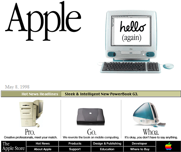
My first steps to learning web development involved just HTML. I went through a basic HTML tutorial which gave me enough information to start building simple websites. I remember creating pages with very square-ish layouts and boxy elements, similar to the websites you’d see back in the late 1990s.
I realized I could’ve been a web designer at Apple, I was just 20 years too late. Anyway, when creating my bare-HTML websites, I would use inline styles for everything since that was all I knew. This worked fine for simple layouts, but when I tried to make more complex ones, things got really messy. It also didn’t help that I was using tables for my layout (we all did at one point…right?). At that point, I knew I needed an upgrade, and that upgrade was CSS.
CSS: expectations
When I was going through the tutorials for CSS, I thought “Wow, this makes a lot of sense. With a stylesheet, I can separate the styles with the HTML. Also, classes allow me to make my styling modular, instead of having to define one for each element. This is going to make web development much easier.” I had a pretty positive outlook on CSS. However, at this point, I was just doing the simple tutorials and had yet to design a nontrivial website.
CSS: reality
 Fast forward about a year (I was busy), I was tasked to build a webpage as part of my internship. Without going into too much detail, the webpage needed to read data from a .csv file, upload the contents into a MySQL database, and display the data in a table. After getting most of the functionality down, I decided to spend some time tweaking the CSS to make it look nice. It didn’t take me long to realize that although CSS made it possible to reuse styles for different elements, I still had add the styles line by line. This soon got really complicated as I tried to add more styles and target specific elements. Fortunately, I was able to finish my webpage and make it look nice. However, I realized that although CSS is a step up from inline HTML, it was still very unpleasant to work with. But then again, what other options do I have?
Semantic UI to the rescue
Over these past few days, I explored Semantic UI, a development framework that promises to make websites both prettier and easier to design. After using it for about a week on several small projects, I believe it achieves just that. I am definitely going to incorporate Semantic in my future web-based projects, here’s why:
Way faster than just HTML and CSS
With Semantic, I was able to recreate a modern and responsive website in less than a day. I encourage you to check out the repository and see the comparison for yourself. Something like that, with just HTML and CSS, would’ve taken me at least a month, possibly even longer.
Styling is intuitive
One thing I really like about Semantic is that class names have meaning: there is a semantic component to them (hence the name Semantic). Here’s an example comparing Semantic and Twitter Bootstrap (another popular framework). Let’s say you wanted to add a large primary button like so:
In Bootstrap, you would need something like:
<button class="btn btn-primary btn-lg">Click</button>
In Semantic it would be:
<button class="ui large primary button">Click</button>
Notice the difference? With Semantic, the styling reads almost like English. This makes styling somewhat intuitive and makes it easier to remember and use the different classes. This is one of the main reasons why Semantic is such a powerful tool.
